Site Plan
Site purpose and content architecture.
The purpose of this site is to be the main website for the Prison to Prison Triathlon. This site will be a place for prospective participants to get information about the triathlon and sign up if they would like. This site will also be a way for people to contact the Prison to Prison Triathlon officials with any questions or comments they may have.
The target audience for this site will be people who want to participate in the triathlon or attend the triathlon just to spectate.
Content and site map.
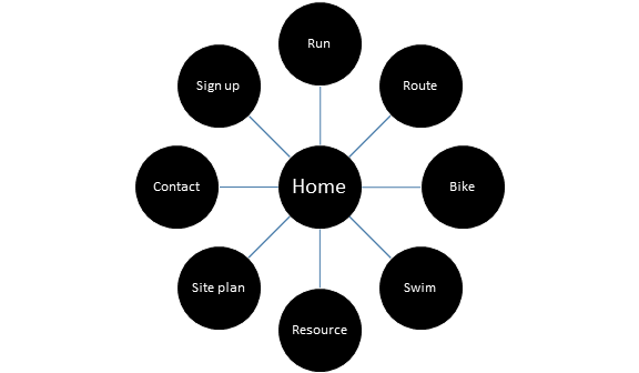
The site will have a home page that can be accessed by any other page, and it can take you to any of the pages listed. The pages will be Home, Run, Route, Bike, Swim, Resource, Site Plan, Contact, and Sign Up. The Run, Swim, Bike, and Route pages will have information about the route and specific details about each part of the race. The Contact and Sign Up pages will be for potential participants to contact me or sign up. The resource page will have a list of the resources I used on this website.
Color scheme, typography, and layout.
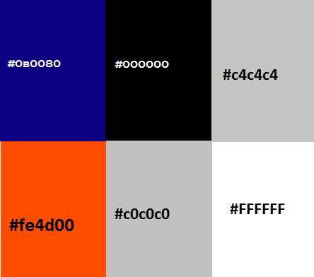
The color scheme for the website really fits and feels like a triathlon around Alcatraz Prison. On larger screens the background will be black with a grey fence tile. It will have a white background in the body (#FFFFFF) and a black (#000000), white (#FFFFFF), and grey (#c4c4c4) navigation bar. The H1 will have international orange font (#fe4d00, the color of the Golden Gate Bridge). The footer will have a grey background (#c4c4c4), black font (#000000), and blue (#0B0080) links. On smaller screens there will be no background, and the main body will be a slightly different grey (#c0c0c0). On all screens the logo will be black (#000000) with international orange (#fe4d00, the color of the Golden Gate Bridge). Also, various blues will be common in the images.
The typography for the site will try to capture the prison culture along with the beauty of the Golden Gate Bridge. The h1 font is international orange, Old English Text MT if the device has it, and Arial or sans-serif if the device doesn’t have it. The paragraph and footer text will be Arial or sans-serif.
Paragraph text – 1.2em
H1 text – 2.2em
Footer links – 1em
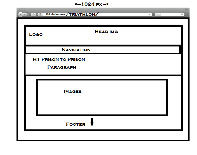
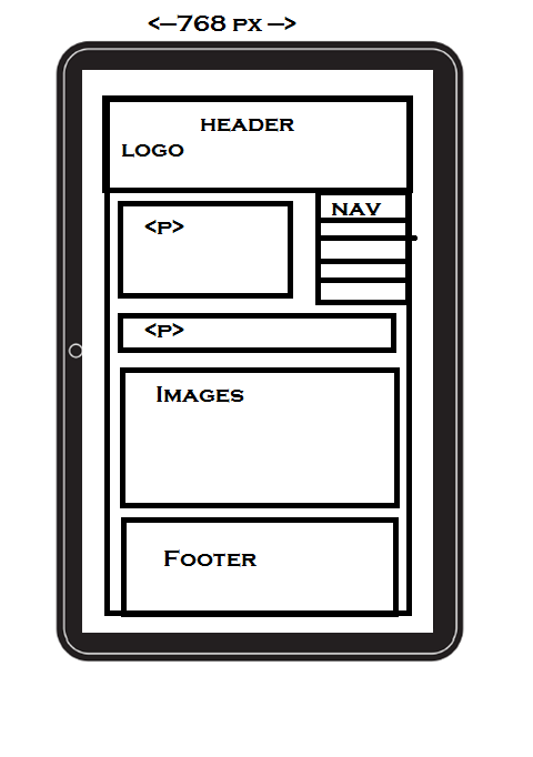
The layout for large devices will have a logo in the header that will link users to the homepage. Under the logo will be a navigation bar with links to most of the pages on the site. The body will be below the navigation bar, followed by the footer, which will contain the remainder of the links for the site. Medium screens will be similar, but the navigation bar will be a vertical list of links on the top right hand side of the body portion of the page.
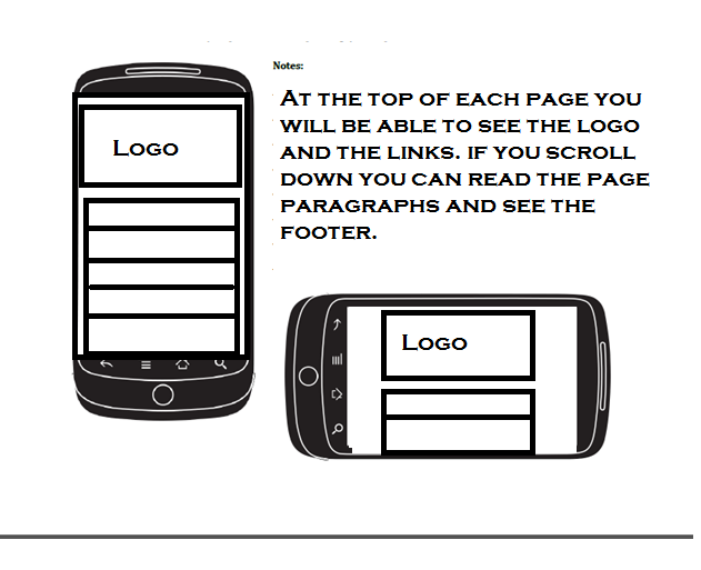
The mobile, or small screen, version of the page will have the logo at the top with navigation buttons below it. Users will be able to scroll down to see the page content and the footer.
